109일차(2)/CSS(8) : 3차원 컨텐츠 만들기(1)
- 화면 UI를 만들 때 3D 컨텐츠를 추가하고 싶다면?
- 구글에 css 3d transform 검색
*참고 사이트: https://3dtransforms.desandro.com/cube
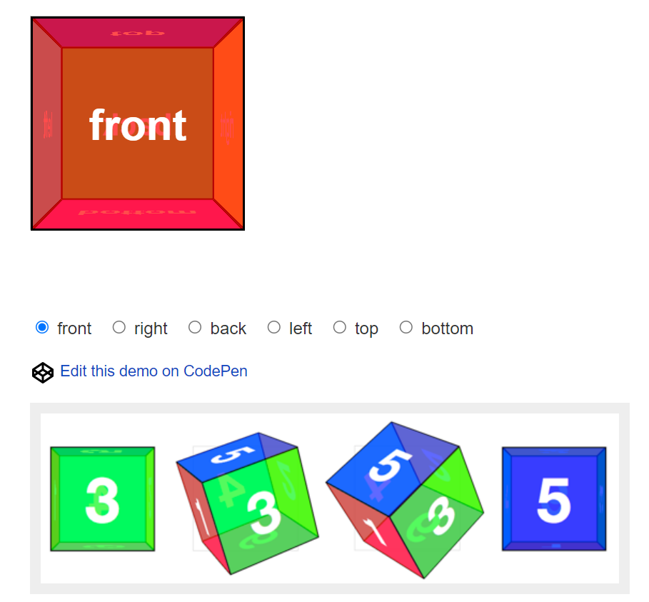
- 3차원 6면체의 형태
- div 요소 6개를 3차원으로 배치해서 이런 입체형 육면체를 만들 수 있다. javascript, css를 결합해서!

- 이런 carrousel 도 만들 수 있다
- css3의 transition, transform, 3d transform을 익히면 3차원 컨텐츠를 만들 수 있다.

- VS code의 경로를 설정하고 사용할 이미지가 들어있는 폴더를 넣어둠
Step01_Transition.html
<!DOCTYPE html>
<html lang="en">
<head>
    <meta charset="UTF-8">
    <meta http-equiv="X-UA-Compatible" content="IE=edge">
    <meta name="viewport" content="width=device-width, initial-scale=1.0">
    <title>Step01_Transition.html</title>
    <style>
        .box{
            width: 100px;
            height: 100px;
            border: 1px solid red;
            cursor: pointer;
            /* css가 변경되는 중간과정을 보여주기위한 css 속성 */
            transition: all 1s linear;
        }
        .box:hover{
            width: 200px;
            height: 200px;
            border-width: 10px;
            margin-left: 100px;
        }
    </style>
</head>
<body>
    <div class="container">
        <h3>transition 테스트</h3>
        <div class="box"></div>
    </div>
</body>
</html>

- 마우스가 hover되었을 때 크기를 두배로 키우도록!
- transition을 사용해서 크기가 커지는 중간 과정을 보여줄 수 있다.

transition: width 1s linear;
transition: height 1s linear;
transition: all 1s linear;
- css에 이런 서식을 주면 각각 가로,세로,둘 다 기준으로 1초에 걸쳐서 box의 크기가 커지는 것을 볼 수 있다.
- linear 는 일정한 비율로 변화하는 것을 의미한다!
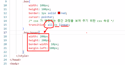
- all은 모든 것에 변경을 가한다는 의미!
Step01_Transition2.html
<!DOCTYPE html>
<html lang="en">
<head>
    <meta charset="UTF-8">
    <meta http-equiv="X-UA-Compatible" content="IE=edge">
    <meta name="viewport" content="width=device-width, initial-scale=1.0">
    <title>Step01_Transition2.html</title>
    <style>
        .box{
            width: 100px;
            height: 100px;
            border: 1px solid red;
        }
        #one{
            transition: all 5s ease-in; /* 처음에 천천히 */
        }
        #two{
            transition: all 5s ease-out; /* 나중에 천천히 */
        }
        #three{
            transition: all 5s linear; /* 계속 일정하게 */
        }
        .margin{
            margin-left: 800px;
        }
    </style>
</head>
<body>
    <div class="container">
        <h3>transition timing function 테스트</h3>
        <div class="box" id="one"></div>
        <div class="box" id="two"></div>
        <div class="box" id="three"></div>
        <button id="startBtn">start</button>
    </div>
    <script>
        document.querySelector("#startBtn").addEventListener("click", function(){
            //클래스가 box인 모든 div를 선택해서 동작하기
            document.querySelectorAll(".box").forEach(function(item){
                console.log(item);
                item.classList.add("margin");
            });
        });

    </script>
</body>
</html>
- timing function 테스트. 각각 실행시점을 다르게 해보았다.

- startBtn을 누르면 box 개체에 각각 마진이 생기면서 이동하게 된다.
- 3개의 움직이는 방식이 각각 다르다.
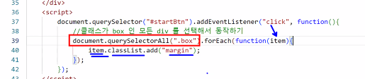
- 모든 div를 [ ] 배열에 담아서 각각의 아이템을 하나씩 참조하면서
classList에 동적으로 margin 클래스를 추가한 것이다.
- 각각의 이동속도는 다르지만 도착하는 지점은 똑같다!
- ease-in; / ease-out; / linear; 이 각각
천천히 시작 / 천천히 마무리 / 일정하게 라는 것을 알 수 있다.
- 보통 ease-out 이 가장 많이 사용된다.
- transition과 timing function 기억하기!
Step02_Transform.html
<!DOCTYPE html>
<html lang="en">
<head>
    <meta charset="UTF-8">
    <meta http-equiv="X-UA-Compatible" content="IE=edge">
    <meta name="viewport" content="width=device-width, initial-scale=1.0">
    <title>Step02_Transform.html</title>
    <style>
        img{
            transition: transform 0.4s ease-out;
        }
        img:hover{
            /* 평행이동, 확대, 축소, 회전, 비틀기 등을 수행할 수 있는 transform 속성 */
            transform: translateX(50px) translateY(50px) rotate(45deg) scale(1.5);

        }
    </style>
</head>
<body>
    <div class="container">
        <h3>transform 테스트</h3>
        <img src="images/puff1.png">
    </div>
</body>
</html>

translateX(50px) translateY(50px)
- x,y좌표 기준으로 50px씩 움직인다.

rotate(45deg) scale(1.5)
- 마우스를 hover시키면 45도 회전시키기, 크기 확대(1.5배) 를 적용한 것
- 이것이 2차원 transition이다.
- 응용해서 3차원 transition 도 적용해볼 예정!
'국비교육(22-23)' 카테고리의 다른 글
| 111일차(1)/CSS(10) : 3차원 컨텐츠 만들기(3) (0) | 2023.03.21 |
|---|---|
| 110일차(1)/CSS(9) : 3차원 컨텐츠 만들기(2) (1) | 2023.03.20 |
| 109일차(1)/Android App(73) : 모바일 갤러리 기능 구현(7) (0) | 2023.03.17 |
| 108일차(1)/Android App(72) : 모바일 갤러리 기능 구현(6) (0) | 2023.03.16 |
| 107일차(1)/Android App(71) : 모바일 갤러리 기능 구현(5) (0) | 2023.03.15 |